
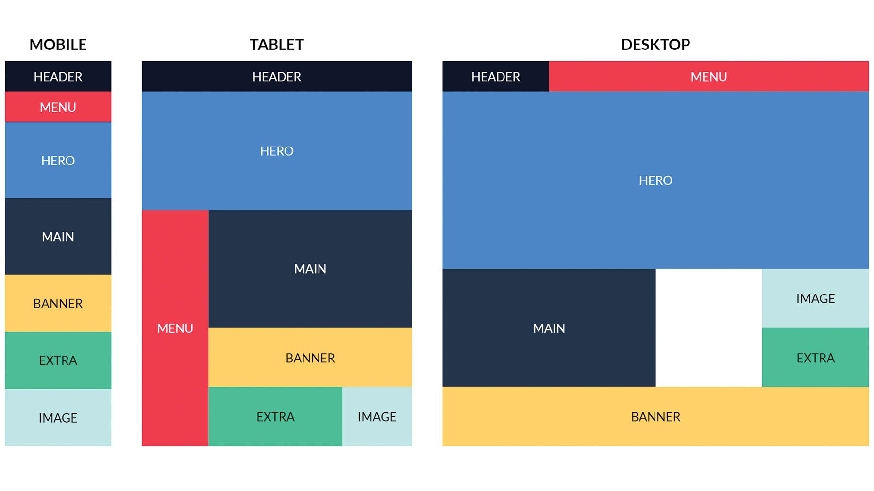
In today’s digital age, having a responsive website is essential. With the increasing use of mobile devices, it’s crucial for websites to adapt to different screen sizes and resolutions. Two popular tools for creating responsive layouts are CSS Grid and Flexbox. In this article, we will explore how to use these two technologies to create a responsive design for your website.
Understanding CSS Grid
CSS Grid is a layout system that allows you to create complex grid layouts with ease. It provides a more robust way of laying out elements on a webpage compared to traditional methods like using floats or positioning. With CSS Grid, you can define rows and columns to organize the layout of your webpage.
Getting Started with CSS Grid
To start using CSS Grid, you need to declare a grid container using the display: grid; property. You can then define the rows and columns of the grid using the grid-template-rows and grid-template-columns properties. Once you have defined the grid, you can place elements within the grid using the grid-row and grid-column properties.
Using Flexbox for Responsive Design
Flexbox is a one-dimensional layout system that allows you to create flexible and responsive layouts. It is particularly useful for aligning and distributing elements within a container. With Flexbox, you can easily create complex layouts that adapt to different screen sizes and resolutions.
Getting Started with Flexbox
To start using Flexbox, you need to declare a flex container using the display: flex; property. You can then define how the elements within the container should be aligned using properties like justify-content and align-items. Flexbox also allows you to control the size of the elements within the container using properties like flex-grow and flex-shrink.
Combining CSS Grid and Flexbox for Responsive Design
While CSS Grid and Flexbox are powerful tools on their own, they can also be used together to create even more dynamic and responsive layouts. By combining the two technologies, you can take advantage of the strengths of both systems to create complex and adaptive designs.
Best Practices for Using CSS Grid and Flexbox Together
When combining CSS Grid and Flexbox, it’s important to understand how the two systems interact with each other. For example, you can use CSS Grid to create the overall layout of your webpage and then use Flexbox to align and distribute elements within the grid. By understanding the strengths of each system, you can create a truly responsive design that adapts to any screen size.
Conclusion
In conclusion, CSS Grid and Flexbox are powerful tools for creating responsive designs for websites. By understanding how to use these two technologies together, you can create layouts that adapt to different screen sizes and resolutions. Whether you’re a beginner or an experienced developer, mastering CSS Grid and Flexbox will take your web design skills to the next level.